CARTIER
Design the History & Legacy page for Cartier's Website
Art Direction · Motion Design
The Pitch
Present the Maison Cartier through its history and creations.
Two different routes were initially presented : One focusing on a timeline, in tune with the rest of the website ; and a second one with an immersive story and historical playful content.
Cartier selected the timeline route to iterate on.
Role
Art Director
Client
Cartier
Brand
Cartier
Route N°1
The Immersive History
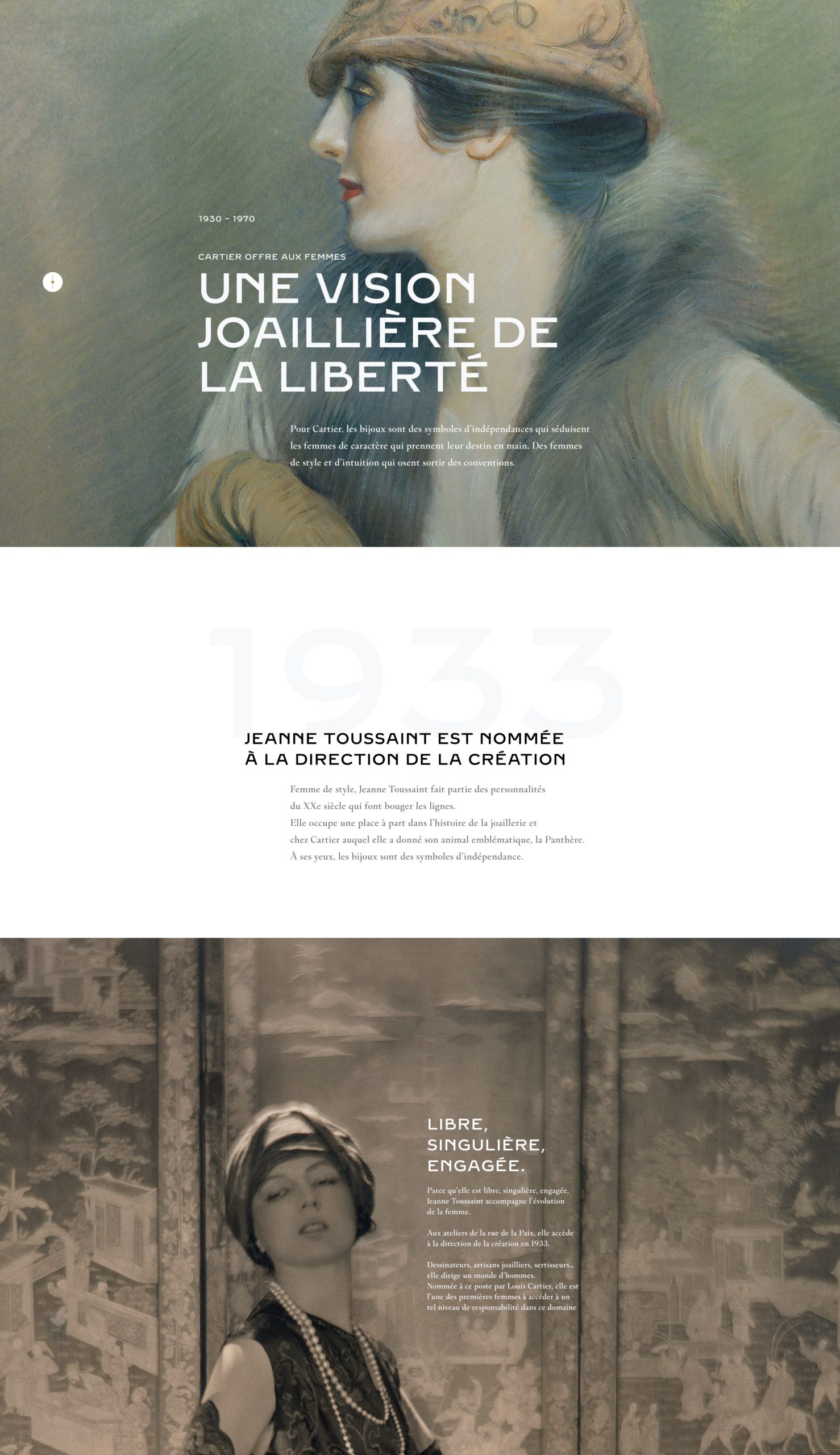
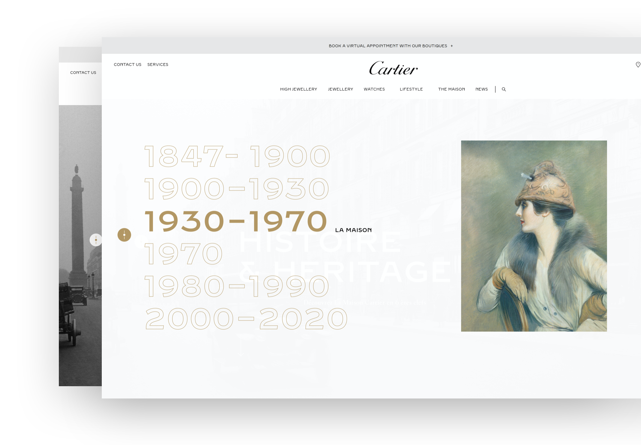
This first creative route places visuals first, with an immersive 3D effect to give life to archive images.
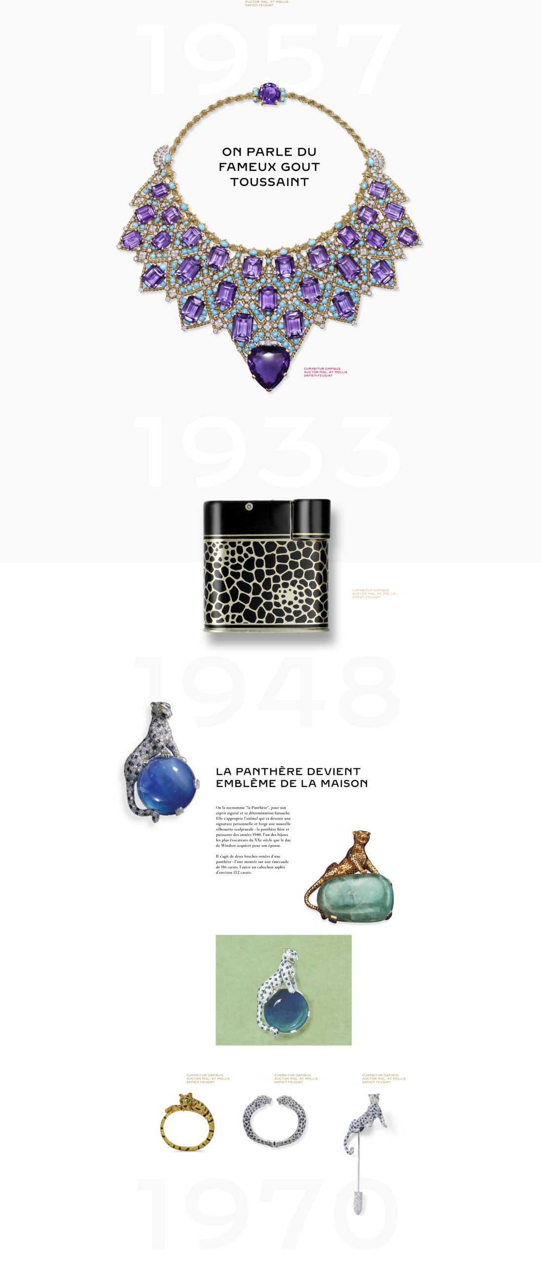
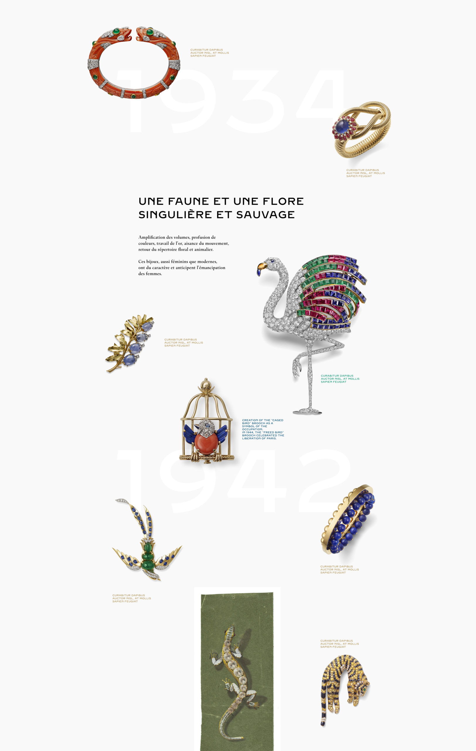
I tried to give the whole page a depth effect, through the images, and also by setting the years in the center of the screen, under the other visuals, letting the user scroll through the amazing pieces made by Cartier on top.
full frame visuals.
To immerse users into historical images.
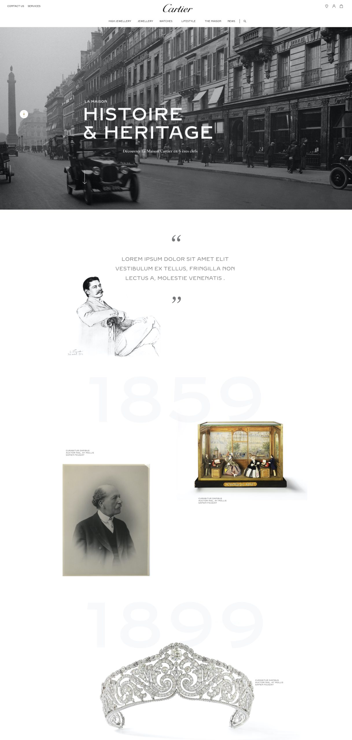
Watermark.
We travel through history with the help of very light "watermark" dates anchored to the center of the screen.
Navigation.
To access the different eras of La Maison Cartier's history, a menu is always accessible on the left hand side.
Immersion &
Interaction.
With the addition of a custom made depth map, I turned the brand's historical visuals into interactive 3D visualisations.
Route N°2
The Timeline
The idea of a visible timeline felt dear to the Cartier team. This first video was the first one shown during the first round of creatives, on which we iterated following Cartier's Creative Director's requests.
Setting up the series of years
To immerse users into historical images.
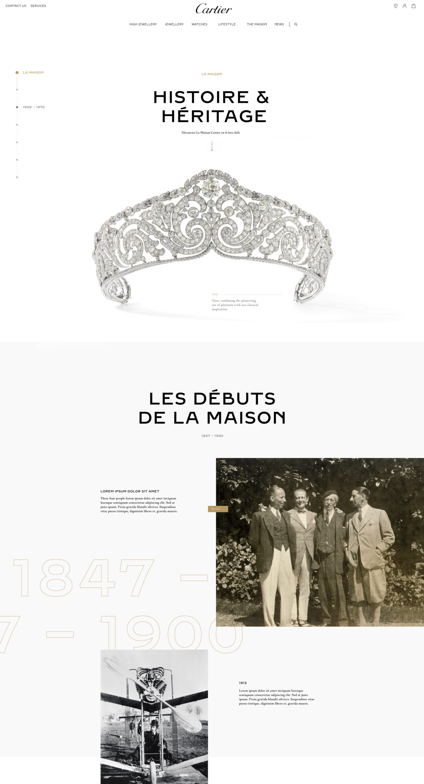
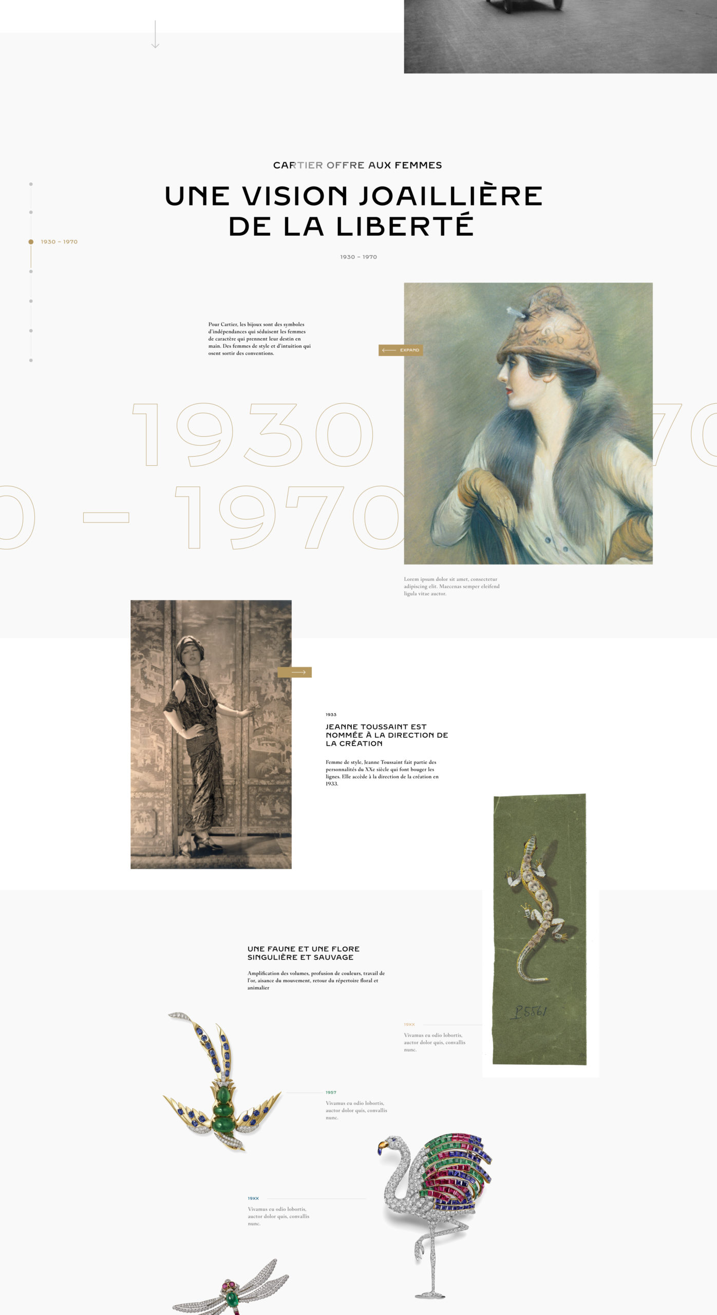
A timeline as a central element.
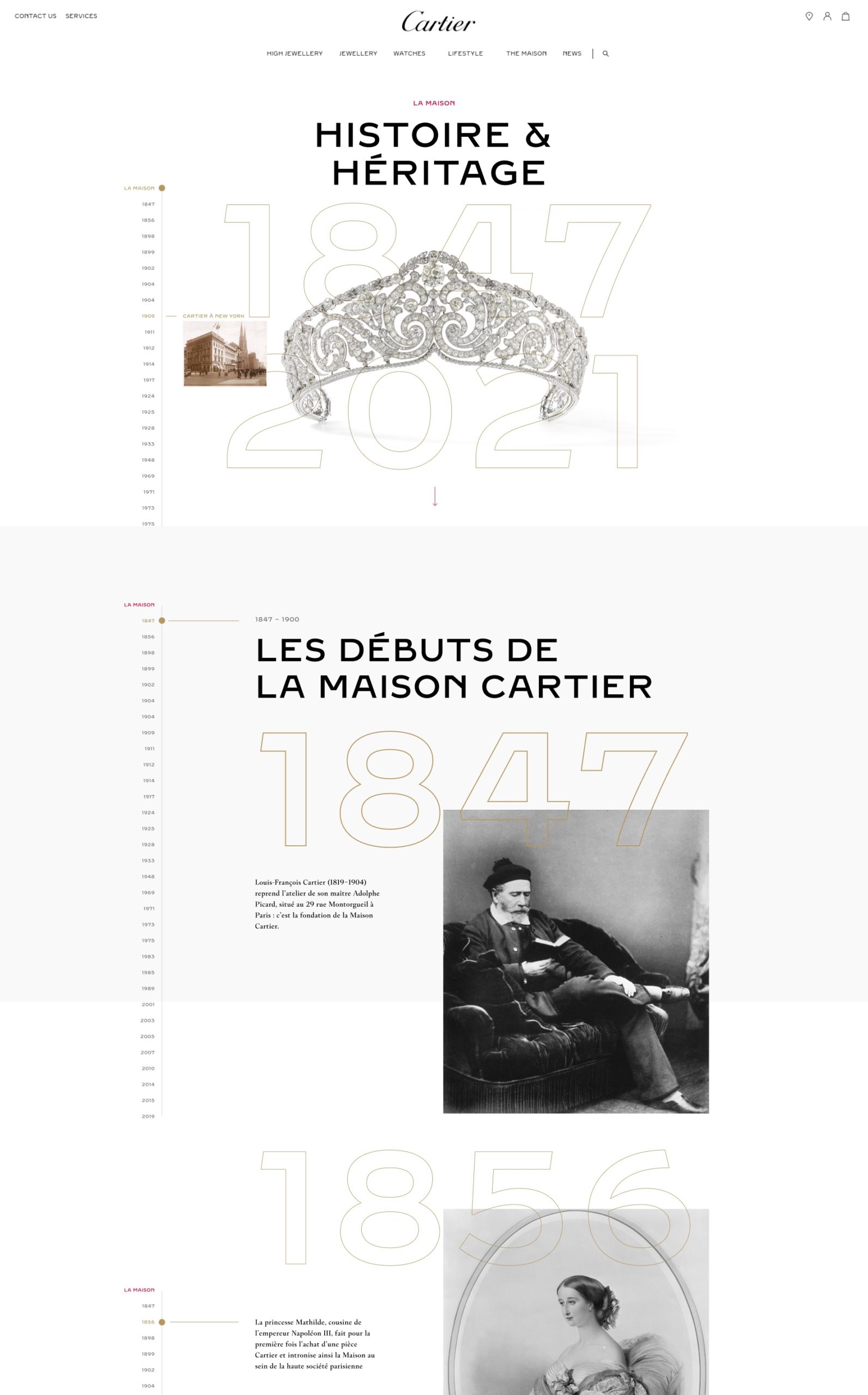
To make it more prominent, I placed the timeline as a central element, with a CTA placed on the bottom of the screen to give the users an easy access to any other year.
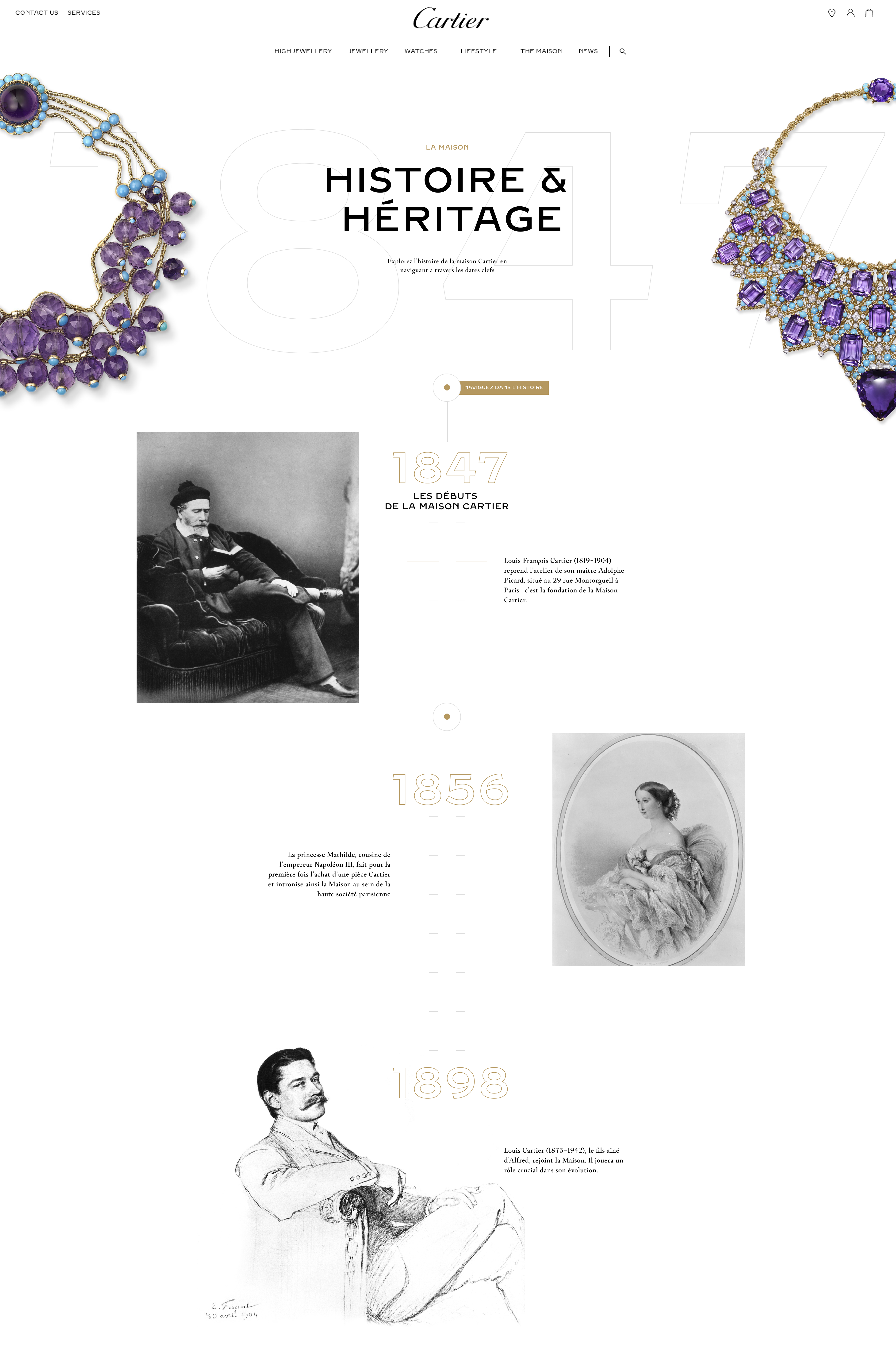
Central Timeline
A version where the timaline was a central element for the user to interact with.
Final version
The final request was to be able to have any of the years accessible from the top of the page.
So I came up with the left sided timeline that would let the user clic any of the years and be taken to this anchor on the same page.
the entire and ever-present timeline.
In order to have as quick access to most of the years from the top of the page, as requested by Cartier's Creative Director, the timeline got moved to the side and will scroll on hover.
Snapshots
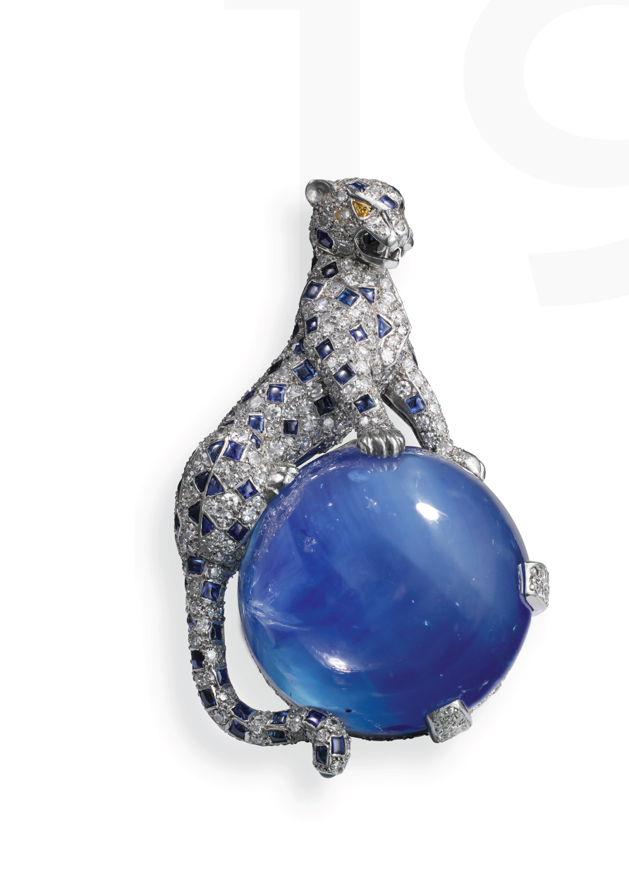
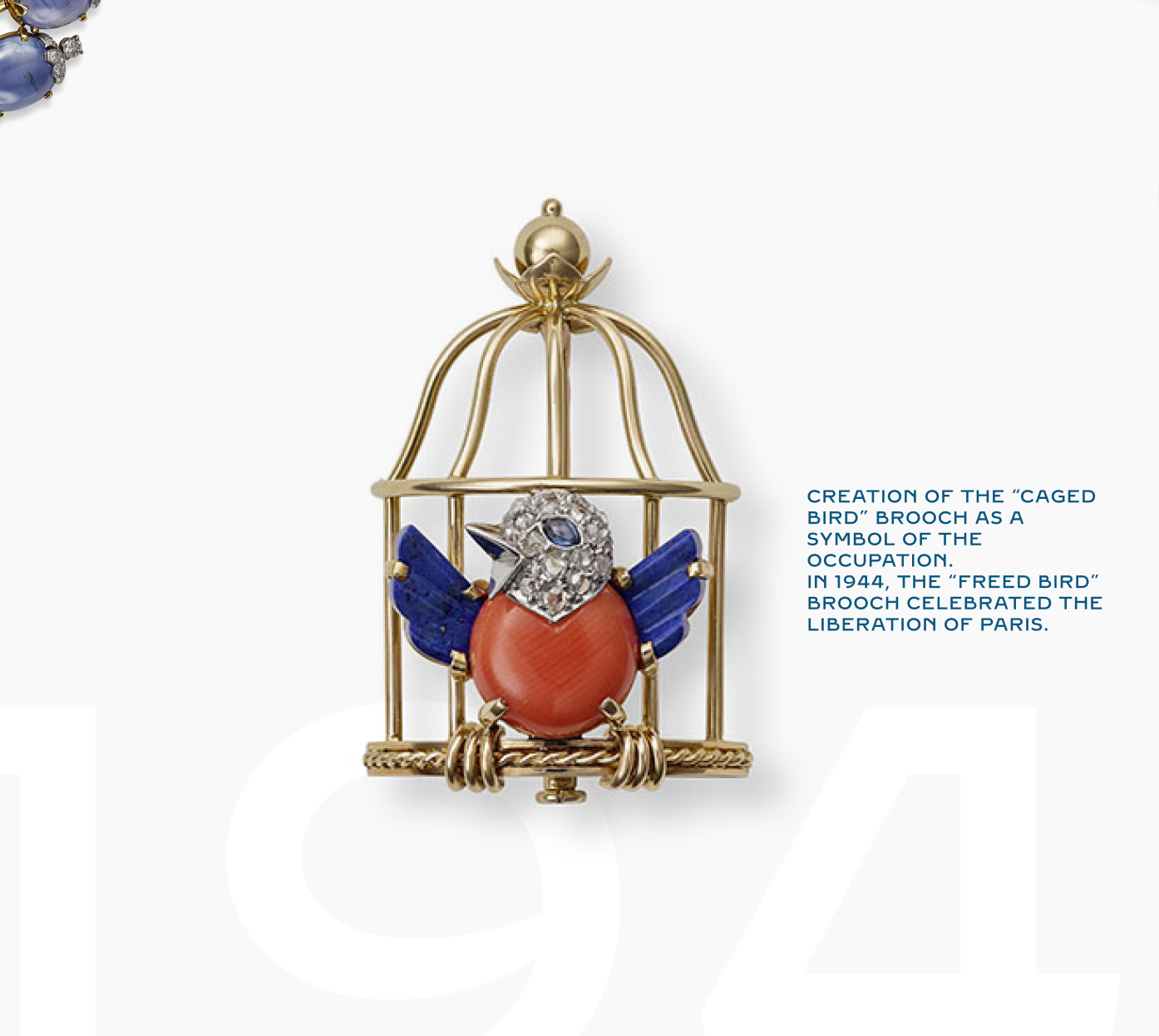
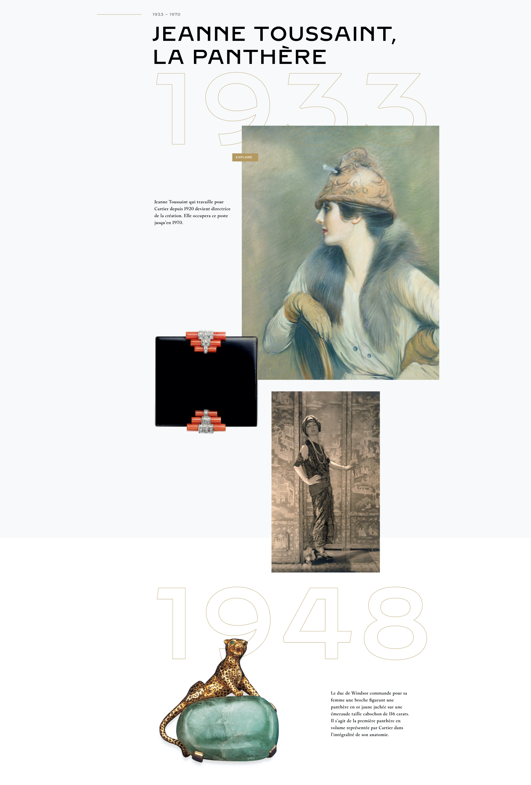
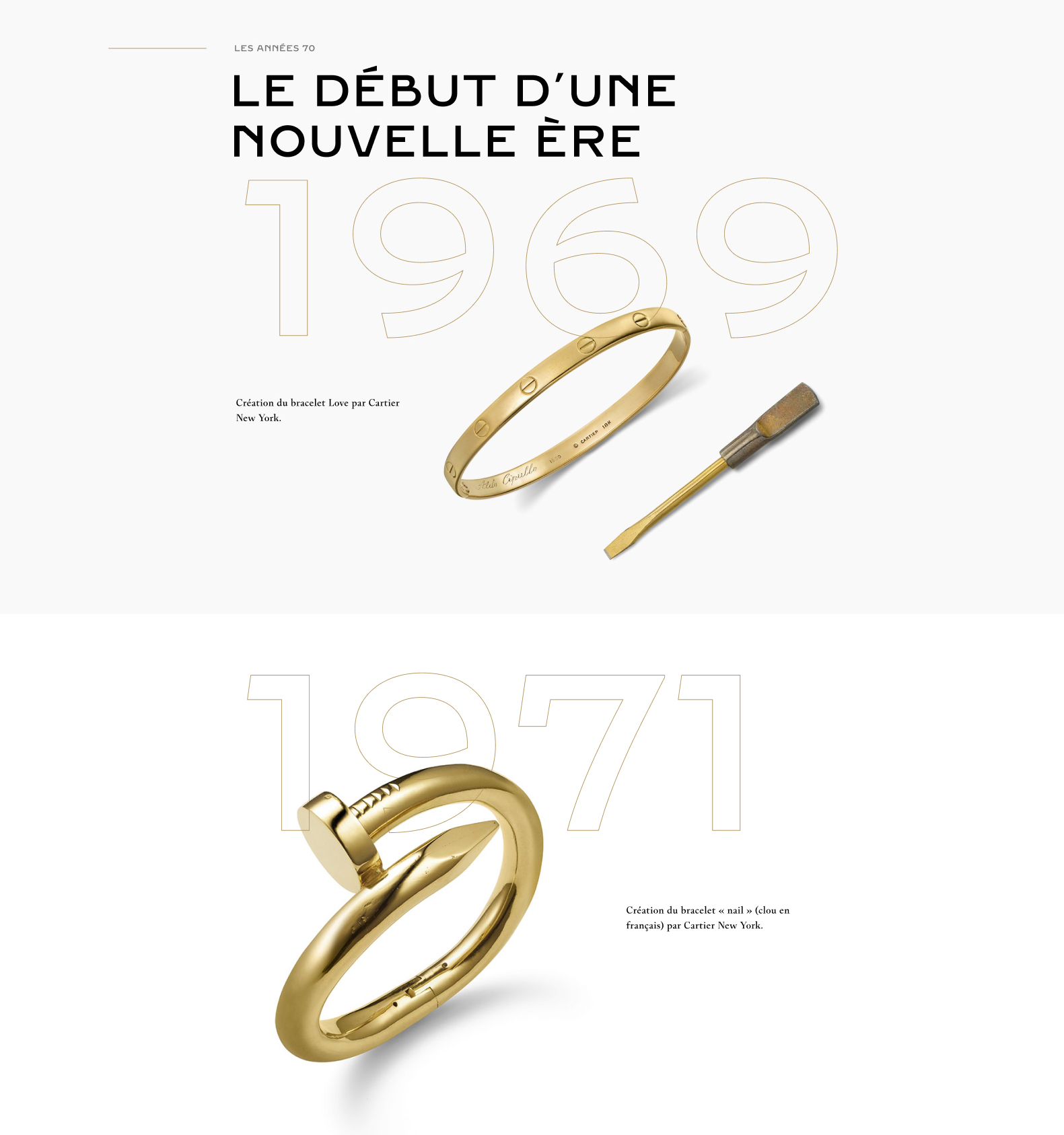
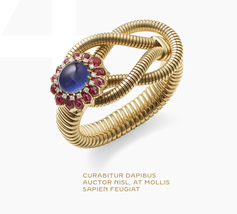
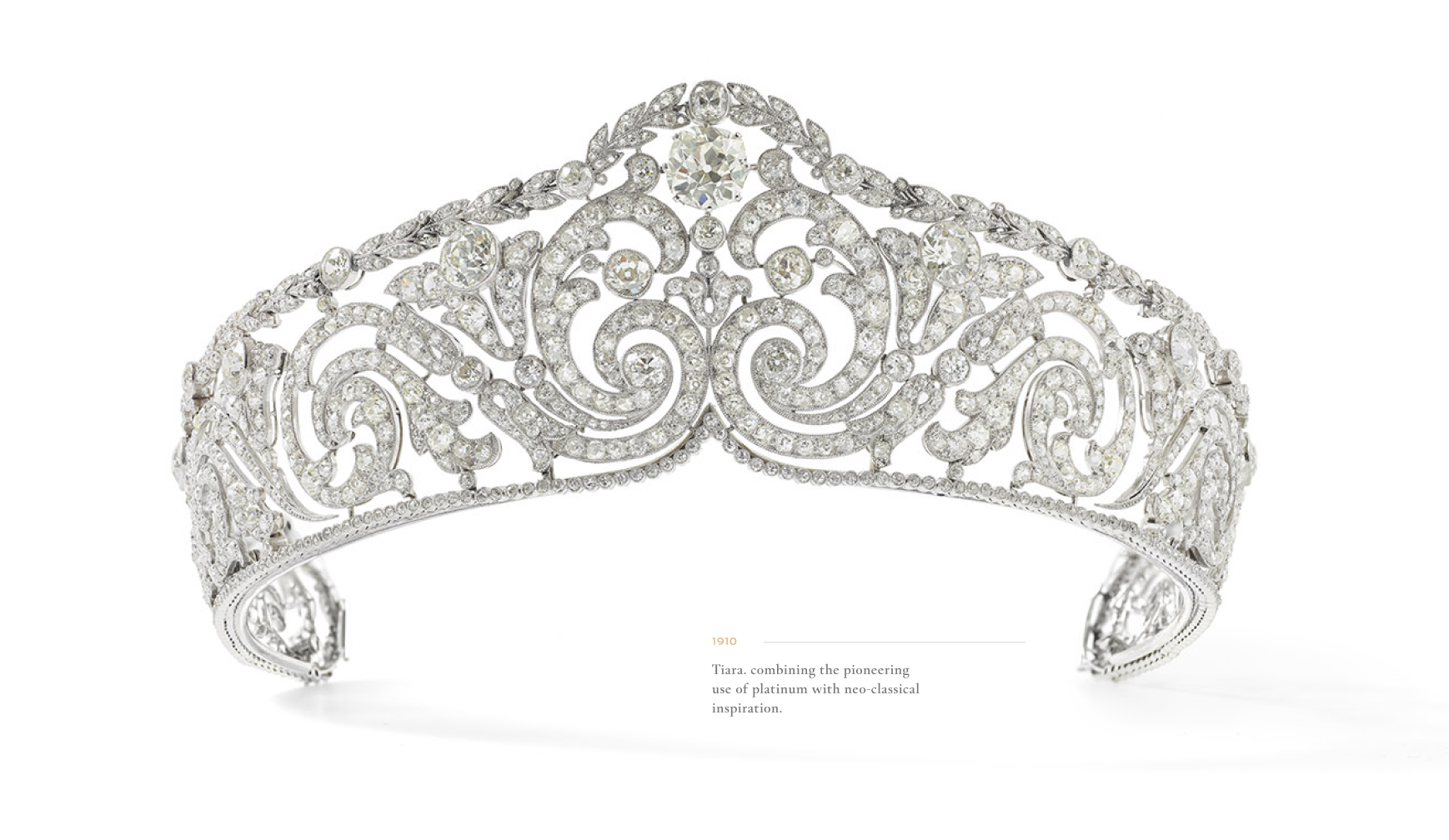
Most of the images of Cartier's creations came shot on a white backgroung. With a little shadow and with the superposition of the creations on the dates of their creation, it gives the impression they are hovering while you scroll through all the great content the brand has to offer.
The Team
Creative - Art Director
Alexis Demachy
Creative Developper
Panagiotis Thomoglou
Project Management at Cartier